PromptCatalog Blog
Customize the Prompt Catalog Widget for Your Website's Brand
Match the widget's accent colors and layout to your brand. Use the built-in max-items pagination plus a few lines of CSS to restyle buttons, filter chips, and pagination arrows on your own site.
Make the widget feel like part of your site
Did you know you can customize the Prompt Catalog gallery widget to fit your branding? It ships with sensible defaults, but two small adjustments — the number of items shown, and the accent color — take it from a generic embed to something that looks like it was designed for your page.
Here's the same widget on the same page, before and after a few lines of CSS:
Before & after — same widget, custom accent color
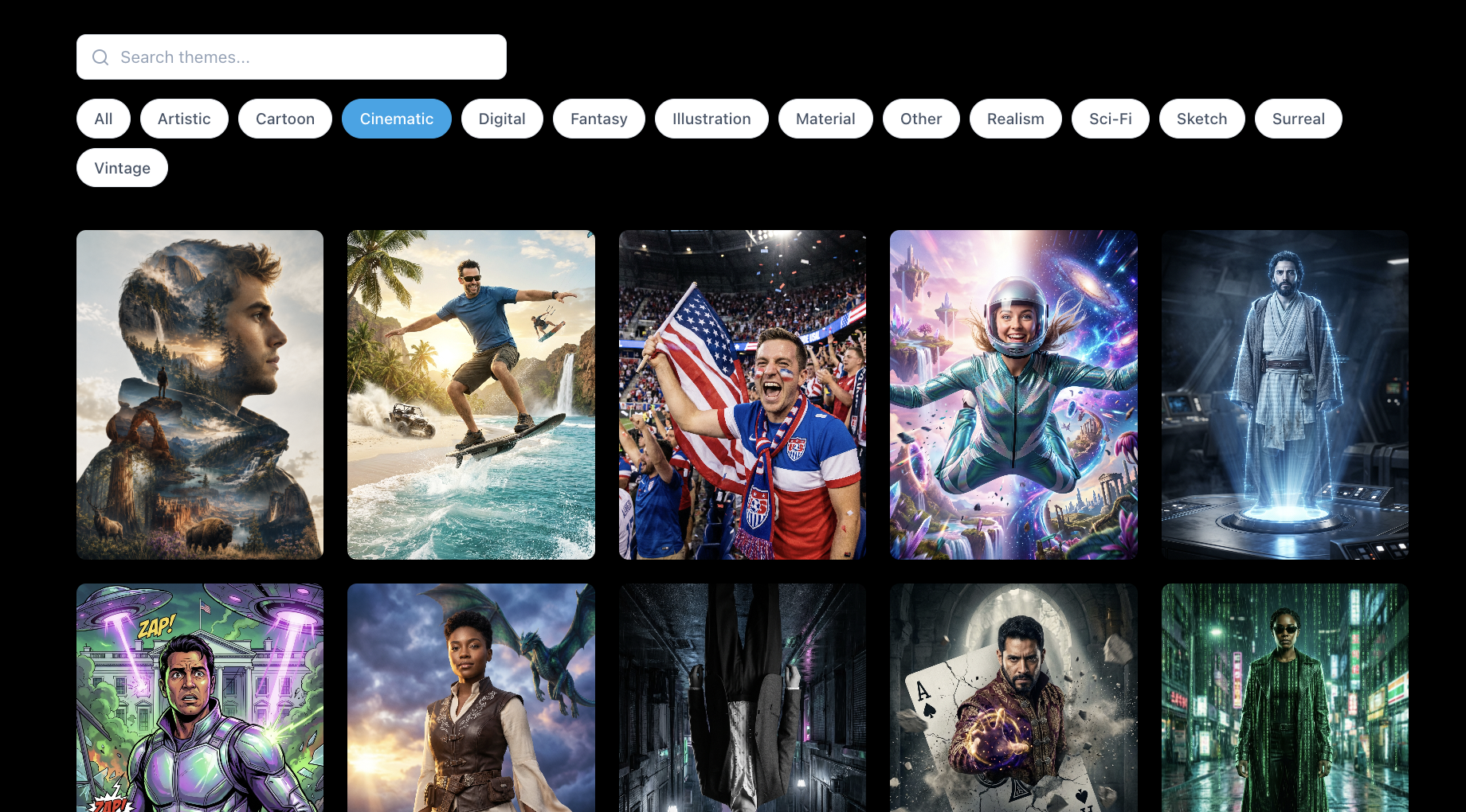
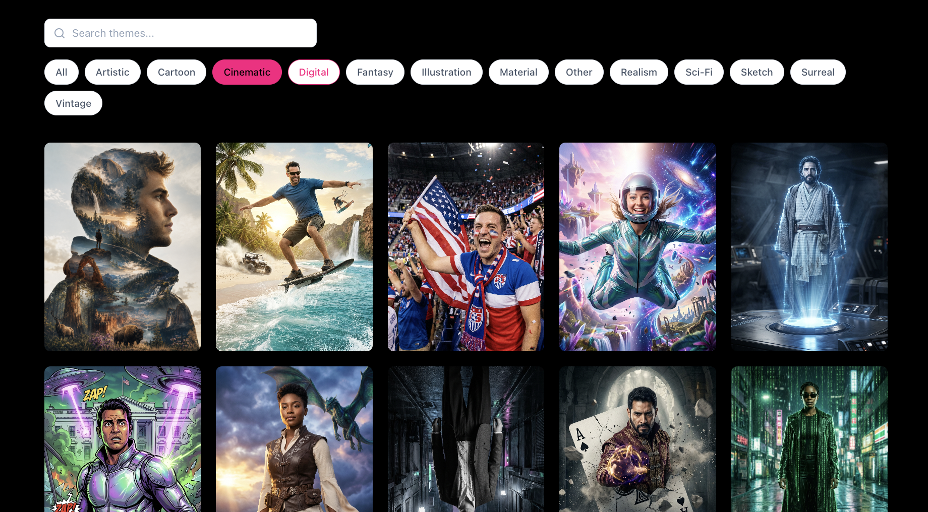
1. Control how many prompts show at once
When you copy the widget embed from your account, the snippet includes a data-max-items attribute. Set this to the number of prompt tiles you want per page — the widget handles the rest with built-in pagination, so your page doesn't turn into an infinitely scrolling list of every prompt in the catalog.
<div id="dp-widget"></div>
<script
  src="https://thepromptcatalog.com/widget.js"
  data-api="https://api.thepromptcatalog.com"
  data-max-items="24"
></script>
Common values: 12 for a compact grid on a landing page,24 for a full gallery section, or drop the attribute entirely to show everything.
2. Recolor buttons, chips, and pagination with CSS
The widget's injected styles use standard class names on the container (#dp-widget), so you can override the accent color from your own stylesheet. No plugin, no build step. Paste this block anywhere on the same page as the widget:
/* Prompt Catalog widget accent overrides (default #0ea5e9 -> Flashbulb pink) */

/* Search box when focused: pink border + soft pink glow ring */
#dp-widget .dp-widget-search-input:focus {
  border-color: #ff0080 !important;
  box-shadow: 0 0 0 2px rgba(255, 0, 128, 0.2) !important;
}

/* Style filter chips on hover (All, etc.): pink border + pink label */
#dp-widget .dp-widget-filter-btn:hover {
  border-color: #ff0080 !important;
  color: #ff0080 !important;
}

/* Selected/active filter chip: pink fill, pink border, black text */
#dp-widget .dp-widget-filter-btn.active {
  background: #ff0080 !important;
  border-color: #ff0080 !important;
  color: #000 !important;
}

/* Previous / Next pagination buttons on hover: pink border + pink label */
#dp-widget .dp-widget-page-btn:hover:not(:disabled) {
  border-color: #ff0080 !important;
  color: #ff0080 !important;
}
What each block controls:
- Search box focus: when a visitor clicks into the search input, the border and glow ring switch from blue to your brand color.
- Filter chip hover: hovering over All, Cinematic, or any style filter previews the accent color on the border and label.
- Filter chip active: the currently-selected filter fills solid with your brand color so it stands out from the others.
- Pagination arrows on hover: the Previous / Next buttons under the grid pick up the accent color when hovered, matching the rest of the widget.
Replace every #ff0080 in the snippet with your own hex color, save, and reload the page. That's it.
Where to add the CSS on your site
To apply the CSS above, use your website editor to add a custom CSS snippet. Where exactly this lives depends on your platform:
- Sometimes you can add it inside the widget or embed element itself — many builders offer a “Custom CSS” field right where you paste the embed code.
- Sometimes you need to open the Theme editor for the page or the whole site and drop the CSS there so it applies to every page the widget lives on.
- Sometimes the cleanest option is to add a custom HTML block next to the widget and paste the CSS wrapped in a
<style>tag inside it.
If you're not sure which of these applies to you, check with your website host or theme documentation — the phrase to search for is usually “custom CSS” or “code injection.” Most modern site builders (Squarespace, Webflow, Wix, Shopify, WordPress) support at least one of these paths.
What would make the widget even more useful for you?
Have another customization or configuration in mind — theme filters preset to your event style, a compact card layout, a dark mode toggle, or something else that would make the Prompt Catalog gallery slot more cleanly into your workflow?
Let us know what you and your clients would like to see next. The widget roadmap is driven by real-world event and booth operator feedback.